您需要 登录 才可以下载或查看,没有账号?注册

x
本帖最后由 毒游小行家 于 2021-10-12 09:13 编辑
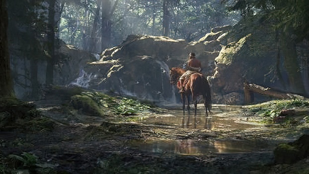
铁杉森林 - 环境分解 - Jonjo Hemmens 文/Jonjo Hemmens
我是 Jonjo Hemmens,目前在 Rocksteady Studios 工作的环境艺术家。我于 2019 年毕业于法尔茅斯大学,之前曾与 Nvidia、Creative Assembly 和 Antimatter Games 合作。 I’m Jonjo Hemmens, an Environment Artist currently working at Rocksteady Studios. I graduated from Falmouth University in 2019 and have previously worked with Nvidia, Creative Assembly, and Antimatter Games.
在花了一年时间制作硬表面道具后,我渴望获得新的东西并填补我游戏艺术技能的空白。我决定将学习有机工作流程作为我下一个项目的优先事项,这与我去年所做的工作接近相反。 发展克服对树叶恐惧的技能是最大的目标。我想通过 Speedtree、Substance Designer 和 Zbrush 进一步提升我的技能,让自己有信心在我的个人工作中处理有机物,这是我一直避免的事情。 After spending a year creating hard surface props, I had the itch to pick up something new and fill a gap in my game art skill set. I decided to make learning organic workflows a priority for my next project which was close to the opposite of what I’d spent the last year working on. Developing the skills to conquer the fear of foliage was the biggest goal. I wanted to push my skills with Speedtree, Substance Designer, and Zbrush further and to give myself the confidence to tackle organics in my personal work which is something I’ve always avoided. 我对该项目的主要灵感之一是观看Jon Park 为 CGCore 社区制作的绘画教学视频。我发现他正在研究的图像以及他分解环境的形式和层次的方式非常鼓舞人心。从这张照片中,我开始建立类似的参考资料和灵感。我发现很多与 Jon 在美国西北部使用的图像相似的参考资料,所以我决定将我的森林设置在那里。 One of my key inspirations for the project was watching Jon Park doing a painting instructional video for the CGCore community. I found the image he was studying and the way he broke down the forms and the layers of the environment to be very inspiring. From this shot, I started building up similar references and inspiration. I found a lot of similar references to the image Jon was using in the American North West, so I decided to set my forest there.
这个项目的动机是花费尽可能多的时间来在有机工作流程中找到自己的立足点,并学习为项目创建资产所需的工具。这是我参与的最长的个人项目,但对我来说非常重要的是,我建立了一套强大的技能,能够在未来创造有机资产,并且不会回避或感到需要依靠外部资源来创建我需要的资产。 The motivation for this project was to spend as much time as I needed to find my feet with organic workflows and learning the tools I needed to create the assets for the project. This is the longest personal project I’ve worked on, but it was very important to me that I built up a strong set of skills to be able to create organic assets in the future and to not shy away or feel the need to lean on external sources to create the assets I need.
学习 Speedtree 是该项目最重要的部分之一。通过大量的学习和坚持,我能够为西部铁杉和红雪松创建所有变体,以及分支地图集,几乎都在 Speedtree 中。为了让我轻松进入 Speedtree,我从一些简单的事情开始,为我的西部剑蕨创建叶子。正如您所看到的,这只是我建模和烘烤的一些叶子,在大部分笔直的树枝上,没有什么令人印象深刻的,但它开始对这个工具有了一些熟悉。 Learning Speedtree was one of the most important parts of the project. With a lot of learning and persistence, I was able to create all of the variations for the Western Hemlocks and the Red Cedars, as well as the branch atlases, pretty much all in Speedtree. To ease me into Speedtree, I started with something simple, creating the fronds for my Western Sword Ferns. As you can see, it’s just some leaves I modeled and baked, on a mostly straight branch, nothing impressive, but it started to build some familiarity with the tool.
在这一点上,为西部铁杉创建分支是一个很大的进步。我使用 Maya 和 Substance Painter 对一些高多边形针叶和松果进行建模和纹理化。然后我将它们带入 Speedtree 以使用“集群”模板组装一些分支。该模板已经设置了 2D 透视图,这让您对它如何适合您的地图集有一个清晰的了解。我为自己切换了叶网格,应用了我的材料,将叶生成模式更改为分叉并设置了一个低阈值,然后进行了一系列设置,直到我对它与参考的比较感到满意为止。 Creating the branches for the Western Hemlock was a big step up at this point. I modeled and textured some high poly needles and pine cones using Maya and Substance Painter. I then brought them into Speedtree to assemble some branches using the “cluster” template. The template is already set up with a 2D perspective which gives you a solid idea of how it’s going to fit onto your atlas. I switched out the leaf meshes for my own, applied my materials, changed the leaf generation mode to bifurcation and set a low threshold, then played with a range of settings until I was happy with how it compared to the ref.
一旦我对每个分支感到满意,我就会使用导出材料工具来渲染您的分支。将整个分支保持在视口中的红色边界内,因为这是 Speedtree 渲染的区域。对于我的第一个树枝图集,我绝对认为我可以通过创建一些更有用的分支并更多地利用我的图集中的空间来进一步推动这一点,但它最终完成了这项工作。 Once I was happy with each branch, I used the export material tool which renders out your branch. Keep the whole branch within the red bounds in the viewport, as this is the area Speedtree renders. For my first tree branch atlas, I definitely think I could push this further by creating some more useful branches and make more use out of the space in my atlas, but it ended up doing the job.
我的分支上的反照率非常均匀,我希望在导出所有分支之前使用了变化滑块。默认情况下,变化颜色输入设置为方便的绿色变化,并且滑块允许您修改强度。这可以为您的材料(如针或叶子)提供一些微妙的颜色变化。即使只使用少量也会产生很大的不同。 The albedo across my branches is really uniform and I wish I had utilised the variations slider before I exported all my branches. The variations colour inputs are set to handy green variations by default, and the slider allows you to modify the intensity. This can provide some subtle colour variations to your materials like your needles or leaves. Even just using a small amount makes a big difference.
在学习新工具或工作流程时,您可能会错过这样的事情。我在项目中发现这个工具太晚了,无法充分利用它,但错过这样的功能很难忘记;我肯定会在未来的项目中充分利用它。 When learning a new tool or workflow it’s possible you’ll miss things like this. I discovered this tool far too late into the project to make the most of it, but missing a feature like this is pretty hard to forget; I’ll definitely be making the most of it on future projects.
准备好树枝后,我开始制作树木。对于我在 Speedtree 的第一棵树,我选择了西部铁杉。Hemlock 并不是一棵特别复杂的树,所以开始学习工具非常好。 With my branches ready I started making my trees. For my first trees in Speedtree, I went for the Western Hemlock. The Hemlock isn’t a particularly complex tree so it was great to start learning the tools with.
第一步是导入我的图集并制作一些分支。我为我的图集设置了新材料,并使用叶子网格切割工具将我的图集分割成叶子网格。Speedtree Youtube 频道简洁地演示了该工具 ,绝对是程序中最有用的工具之一。视频没有提到的一件事是,如果您单击 Speedtree 或 Window,该工具将立即关闭。如果您尚未将新分支应用于高、中或低输入,您将失去进度。 The first step was to import my atlas and make some branches. I set up new materials for my atlas and used the Leaf Mesh Cutout tool to split my atlas into leaf meshes. The Speedtree Youtube channel demonstrates the tool concisely and is definitely one of the most useful tools in the program. One thing the video doesn’t mention is that if you click off Speedtree or off the Window, the tool will close instantly. If you haven’t applied your new branches to either the high, med, or low inputs, you will lose your progress. Matt Strieby 的详细绘图 (2018.03)。
准备好叶子网格后,我移到了树的基础上。Hemlock 没有太多困难的元素。我努力让一些中型和大型树的顶部看起来正确,因为我试图用一组节点来做所有的树枝和树叶。后来,我意识到我可以有多组分支,一些覆盖下半部分,一些覆盖上半部分。这让我对不同体积的树木区域有了更多的控制。 With my leaf meshes ready I moved onto the foundation of the tree. The Hemlock doesn’t have too many difficult elements. I struggled to get the tops looking correct on some of the medium and large-sized trees as I was trying to do all of the branches and leaves with a single set of nodes. Later on, I realized that I could have multiple sets of branches, some that would cover the lower half and some that would cover the top half. This gave me a lot more control over areas of the trees that just had different volumes.
我想为每个树创建一系列大小和变化,因为我知道只有两种类型的树,重复可能是一个问题。我最终为 Hemlock 制作了 3 种大型、3 种中型和 4 种小型。在这些变化中,有些更薄,有些更厚,而小的则试图展示早期生长的不同阶段的树木。 I wanted to create a range of tree sizes and variations for each, as I knew with only two types of trees, repetition could be a problem. I ended up making 3 large, 3 medium, and 4 small types for the Hemlock. Within these variations, some are a bit thinner, some are thicker, and the small ones try to show the tree at different stages of early growth
让铁杉的顶部正确地弯腰会带来一些问题。我试图给后备箱增加额外的重力,但这非常具有破坏性。我找到了将我的行李箱转换为手绘资产的选项,这使我可以使用节点来塑造行李箱。 Getting the top of the hemlock to stoop properly presented a bit of a problem. I tried to add additional gravity to the trunk, but this was quite destructive. I found the option to convert my trunk into a hand-drawn asset, which allowed me to use nodes to shape the trunk.
手绘可以从树的开始使用,在这个 Speedtree 教程中得到了最好的演示。虽然我只用它解决了一个小问题,但这个工具为我未来的树开辟了很多潜力。 Hand drawing can be used from the start of a tree and is best demonstrated in this Speedtree tutorial. Although I only used it for one small problem, this tool opens up a lot of potential for my future trees.
我制作的第二组树是西部红柏。我大致遵循了相同的过程,但应用了我以前从铁杉中学到的很多东西。我认为这些树缺乏一些变化,但我对一些更精细的细节感到满意。 The second set of trees I made was the Western Red Cedars. I broadly followed the same process for these but applied a lot of what I learned from doing the hemlocks previously. I think these trees lack a bit of variation, but I was happier with some of the finer details.
我在 Red Cedar 图集中添加了一些光秃秃的树枝,这增加了一些噪音并帮助打破了一些较厚的针团。 I added some bare branches into the Red Cedar atlas, which added some noise and helped break up some of the thicker clumps of needles.
我对这种变化的不对称性感到非常满意。它提供了良好的重力感,并显示出茂密树枝的重量将旧树枝拉下。但是,我发现它在森林中挡住了很多视线,所以我不得不谨慎使用它。 我认为对于我在 Speedtree 中的第一组树,我很高兴,但我仍然需要学习如何在我的树中引入更多多样性。关于创建树木的工具和艺术,我还有很多东西要学习。 I was pretty happy with the asymmetry of this variation. It gave a good sense of gravity and showed the weight of the dense branches pulling down on an old branch. However, I found that it blocked a lot of sight through the forest, so I had to use it sparingly. I think for my first set of trees in Speedtree, I’m pretty happy, but there’s so much I still have to learn about how to introduce more variety into my trees. There is still so much for me to learn about the tool and the art of creating trees.
在未来,我想解决一些更梦幻的事情。我深受Adrien Paguet-Brunella作品的启发。他发布了一些他为刺客信条瓦尔哈拉工作的令人难以置信的树木。他的个人资料充满了我在游戏中见过的一些最好的树叶作品。我希望将来能够制作一些这样的英雄树,而不仅仅是具有小的基本变化的通用集合。 In the future, I want to tackle something a bit more fantastical. I’m massively inspired by the works of Adrien Paguet-Brunella. He posted some incredible trees that he worked on for Assassin’s Creed Valhalla. His profile is filled with some of the best foliage work I’ve seen in games. I hope to be able to make some hero trees like this in the future, rather than just generic sets with small basic variations. 制作植物/花卉/杂草/草的方法(基本工作流程讲解) 由于这是我第一次尝试创建树叶资源,我不知道如何正确创建灌木和植物。在过去的一年里,我的头一直处于硬表面模式。为了开始学习一些好的工作流程,我参考了 Peyton Varney 的Protégé Foliage Tutorial。我还查看了Karen Stanley 的教程,该教程遵循类似的工作流程,但也有一些出色的技巧。我分享这些教程的次数比我记得的要多,因为它包含许多非常有用的技巧。我发现在开始 highpoly 阶段之前,我更喜欢在我的 blockout 阶段组装我的图集布局,而且我通常在 Painter 中而不是在设计师中进行纹理化。我不会向您重复他们的教程,而是介绍我偏离他们教程的领域。 As this was my first attempt at creating foliage assets, I had no idea how to create shrubs and plants properly. My head had been in hard-surface mode for the past year. To start learning some good workflows, I referred to Peyton Varney’s Protégé Foliage Tutorial. I also checked out Karen Stanley’s tutorial which follows similar workflows but has some excellent tips too. I’ve shared these tutorials more times than I can remember as it contains a lot of incredibly useful tips. I found that I prefer to assemble my atlas layout in my blockout stage before I start the highpoly stage and I usually texture in Painter over designer. Instead of repeating their tutorials back to you, I’ll cover the areas where I’ve deviated from their tutorials.
为了确定我想要建模的内容,我找到了为华盛顿金县创建的本地植物指南,这大致就是我的场景设置的地方。该网站包含该地区发现的所有本地植物,我花了好几个小时对其进行筛选。该网站有大量关于每种植物的信息以及一些照片,让您可以很好地了解植物类型。我最终更多地根据我认为有趣或具有挑战性的植物来挑选植物,以模拟肯定会在森林中找到的植物。 我最终挑选的最有趣的植物是响尾蛇车前草、Longipetala 和卡马斯。他们每个人都遇到了一些非常困难的建模挑战,而且看起来各不相同。 To work out what I wanted to model, I found a Native Plant Guide created for King County in Washington which was roughly where my scene was set. This website had all of the native plants found in the region, which I spent a good few hours sifting through. The website has tonnes of information about each plant as well as some shots for you to get a good idea of the type of plant. I ended up picking the plants based more on what I felt would be interesting or challenging to model over ones that would definitely be found in a forest. The most interesting plants I ended up picking were the Rattlesnake Plantain, the Longipetala, and the Camas. Each of them had some really difficult modelling challenges and looked distinct.
这是我将 Longipetala 植物带入 Zbrush 之前的封闭模型。我把整个图集都屏蔽了,所以我知道当我的雕刻通行证完成时,我可以导出和烘焙。正如您在屏幕截图中看到的,我已经提前设置了材质颜色,因此可以快速创建透明蒙版。当您想将材料应用于网格的繁琐部分时,它也很有帮助,而这会使手绘令人沮丧。我把花上的花粉尖做成了黄色的 ID,这样我就可以节省手动屏蔽每个花粉的时间。侧面的蓝色条带是一种通用茎,我将在组装管网以将花朵连接到植物上时使用它。 Here are the blockout models for the Longipetala plant right before I brought it into Zbrush. I have the whole atlas blocked out so I know when my sculpting pass is complete, I can export and bake. As you can see in the screenshot, I’ve got my material colours set up early so I can create a transparency mask quickly. It also helps when you want to apply a material to a fiddly part of your mesh that would be frustrating to hand paint. I made the pollon tips on the flowers a yellow ID so that I would save time having to manually mask out each one. The blue strip on the side is a bit of a generic stem that I will use when assembling tube meshes to attach the flowers to the plants.
在教程中,Peyton 和 Karen 使用 Substance Designer 为他们的植物贴图,但我更擅长使用 Painter,所以我改用它。因为我计划用类似的材料创建很多植物,所以我在 Painter 中为花瓣和茎/叶创建了一组智能材料。两种材料在设计上都是通用的。它们包括基本颜色、粗糙度变化、微观高度细节和一些基本的地下值。它们旨在建立并避免我每次都从头开始。启动新的 Painter 文件时,请确保在使用它们引入智能材料之前添加不透明度和散射通道。 In the tutorials, Peyton and Karen use Substance Designer to texture their plants, but I’m a bit more capable with Painter, so I use that instead. Because I planned on creating a lot of plants with similar materials, I created a set of Smart Materials in Painter for both the petals and the stems/leaves. Both materials were generic by design. They included basic colours, roughness variation, micro height details, and some basic subsurface values. They were designed to be built upon and to save me from having to start from scratch each time. When starting a new Painter file, make sure you add the opacity and scattering channels before you bring in smart materials using them.
然后我应用我的智能材料并使用 Painter 中的颜色选择蒙版来隔离每个部分。为了节省一点思考,我总是尝试为每个元素使用相同的颜色。例如,我总是为不透明蒙版使用相同的粉红色调。 我不会分解我制作的每一种材料,而是将人们推向Jason Ord和Rick Greeve的 Painter Tutorials 教程。尽管它们都涵盖了硬表面资产,但它们涵盖了 Substance Painter 中的许多基本技能,我经常使用这些技能来获得您决定纹理的任何资产的可靠结果。 I then apply my smart materials and use the color selection mask in Painter to isolate each part. To save a bit of thinking, I always try to use the same colours for each element. For example, I always use the same pink hue for the opacity mask. Rather than break down every material I made, I would push people towards the Painter Tutorials tutorials of both Jason Ord and Rick Greeve. Despite the fact they both cover hard surface assets, they cover a lot of fundamental skills in Substance Painter that I use regularly to get solid results with any asset you decide to texture.
推你的纹理进一步由贾森·奥德涵盖了从如何识别一路下跌到建立自己的基础材料,并建立所有的细枝末节很好的参考制绒工艺的每一个部分。 创建和纹理与自定义模具由里克Greeve让你的手怎么画重要的是一个伟大的想法,以及如何去创建自己的模板。 当我对我的纹理感到满意时,我会将它们导出并导入 Maya,然后开始将图集切割成单独的部分。首先组装一些基本部件会使生活更轻松。对于长花瓣,我有一个扁平的圆形底座,我将在上面铺上叶子簇,使植物有一定的体积。如果我打算弯曲或变形网格,我将添加一些额外的边缘循环,然后在优化时删除任何不会显着改善植物轮廓或形状的边缘循环。 by Jason Ord covers every part of the texturing process from how to identify good references all the way down to setting up your own base materials and building up all the nitty-gritty details. Creating and Texturing with Custom Stencils by Rick Greeve gives you a great idea of how important hand painting is and how you can go about creating your own stencils. When I’m happy with my textures, I’ll export and bring them into Maya and start cutting the atlas out into individual parts. Assembling some basic pieces first makes life a lot easier. With the long petals, I had a flat circular base on which I would layer the leaf clusters on top to give the plant some volume. If I plan on bending or deforming a mesh, I’ll add some additional edge loops, then remove any that don’t significantly improve the silhouette or shape of the plant when optimizing.
对于花的茎,我创建了一个三角形管。我发现这些从各个角度看都比平面好得多,而且只是稍微贵了一点。从 912 tris 的游戏开发角度来看,植物的这种变化非常昂贵,使其成为场景中最昂贵的地面植物之一。这是迄今为止场景中最详细的植物,它在特定地点很少使用,不像其他一些植物,如密集使用且几乎无处不在的三叶草。 For the stems of the flowers, I created a triangular tube. I found that these looked far better than flat planes from all angles, and were only marginally more expensive. This variation of the plant is quite costly from a game development perspective at 912 tris, making it one of the most expensive ground plants in the scene. This was by far the most detailed plant in the scene and it’s used quite rarely in specific spots, unlike some of the other plants like the clovers which are used densely and almost everywhere.
这里有一些 Marmoset 渲染图,展示了植物的所有荣耀。虽然在某些地方有一些剪裁,但几乎不可能避免这种情况(尤其是当您在引擎中添加风效果时)。最后我对这些非常满意,因为它们看起来非常接近现实世界的对应物,并且它们在场景中引入了一些急需的颜色变化。 Here are some Marmoset renders showing the plant off in all its glory. Although there is some clipping in places, it’s almost impossible to avoid this (especially when you add wind effects in Engine). I was pretty happy with these in the end as they look quite close to their real-world counterparts, and they introduced some much-needed colour variety into the scene.
Below:
Shot of the Longipetala in Marmoset
Shot of the Longipetala in amongst the other foliage
为了挑战自己并进一步提高我使用该工具的技能,我专门在 Substance Designer 中为该项目创建了所有主要材料。深入了解该工具的优势并构建良好的工作流程对我来说是一个很大的目标。 我在该项目中创建的第一件事是西部铁杉树皮,这是迄今为止对我来说最大的学习曲线。我花了大约一个月的时间摸索这种材料,找到自己的脚并重新开始几次。根据参考制作准确的断裂树皮碎片非常困难,我仍然觉得它可以做得更好。 To challenge myself and to push my skills with the tool further, I created all the main materials for the project exclusively in Substance Designer. Learning more about the strengths of the tool and building good workflows was a big goal for me. One of the first things I created in the project was the Western Hemlock bark, which was by far the biggest learning curve for me. I spent about a month fumbling around with this material, finding my feet and re-starting a couple of times. Creating the fractured bark pieces accurate to the reference was very difficult and I still feel like it could be done better.
我的项目目标之一是在 Substance Designer 中积累经验。作为游戏环境美术师,Substance Designer 主要用于创建平铺材质,但可以用于许多不同的 3D 工作流程,例如扫描处理、资产纹理、烘焙等。它是一个非常强大的工具,我希望能够展示我的过程。 One of my project goals was to build up experience in Substance Designer. As a games environment artist, Substance Designer is primarily used to create tiling materials but can be used in many different 3D workflows, such as scan processing, asset texturing, baking, etc. It’s an incredibly powerful tool, and I hope to be able to show my process.
我为这个项目创建的第一个材料是西部铁杉树皮。这种材料对我的技能水平来说是非常具有挑战性的,但它提供了很多学习形状生成和细节的机会。 The first material I created for this project was the Western Hemlock Bark. This material was seriously challenging for my skill level, but it provided a lot of opportunities to learn about shape generation and detailing.
这是材料的主要参考。我选择它是因为我喜欢树皮板向外分裂和剥落的方式。木头上的锯节也有一个非常漂亮的圆形图案。我认为尝试它们会很有趣。我的材料最终肯定与原始参考资料有很大差异。我的结又大又粗,板块之间的缝隙中有更多的反照率对比。这些更改是为了改善引擎中的外观,但除此之外,与参考相比,我可以看到许多质量和细节方面的缺陷,这些缺陷是我没有实现的。 这将是我分解图表,显示我的工作截图,并指导您了解我如何实现结果的关键。不幸的是,我的图表绝对是一场灾难。前半部分有一定的结构感,但是一旦我开始细化,它就会变成一大堆无法阅读的意大利面。我真的不以此为荣。 This was the primary reference for the material. I picked it because I liked the way that the bark plates split and peeled outwards. The sawn knots in the wood also have a really nice circular pattern. I thought they would be a lot of fun to attempt. My material definitely ended up deviating quite a bit from the original reference. My knots are quite large and chunky, there is a lot more albedo contrast in the crevices between the plates. These changes were made to improve the look in-engine, but aside from that, I can see a lot of flaws in quality and detail that I didn’t achieve compared to the ref. This would be the point where I would break down the graph, show screenshots of my work, and guide you through how I achieved my results. Unfortunately, my graph is an absolute disaster. The first half has some sense of structure, but as soon as I start detailing, it becomes a massive pile of un-readable spaghetti. I am really not proud of this one.
回到这篇文章的材料,我尝试了几个小时来解开这个烂摊子,但没有挽救它。我不能再告诉你它是如何工作的了,如果我想对这个材料的任何细节进行重大改变,找出发生任何变化的地方将是一场真正的斗争。 Returning to this material for this article, I tried for a few hours to un-knot this mess, but there’s no saving it. I could not tell you really how it works anymore, and If I wanted to make a significant change to any of the details of this material, it would be a real struggle to find out where any changes happen.
我意识到这已经太晚了,无法修复它,相反,我非常确定我未来的图表具有适当的结构,以便您可以随着材料的发展而跟踪材料,并查看正在进行哪些有意义的更改。我的污垢和针头材料的图表要干净得多。稍后我将讨论我如何设法缩小图形的大小以及为此做出的结构决策。 I realised how bad this was too late to fix it and instead I made very sure that my future graphs had proper structure so that you can follow the material as it develops and see where meaningful changes are being made. The graph for my dirt and needles material is much cleaner. I’ll talk about how I managed to downsize my graphs and my structure decisions for this a bit later.
任何森林地面的底部通常都散落着许多断枝、针叶、枯叶和鹅卵石,以及许多植物。 创建基础污垢可以分为几个步骤。虽然早期有很多节点,但我基本上只是尝试创建一个具有足够有趣的主要和次要形式的高度图,以避免当材料在景观上平铺时出现任何明显的地标。 这种噪音通过定向包裹被推动,它将我的噪音贴图与预制的污垢贴图混合在一起。这超级快速地添加了许多污垢细节,并与之前制作的高度信息完美融合。之后,我对一些其他噪音进行采样以添加一些额外的细节,我就完成了。 The base of any forest floor is usually scattered with lots of broken branches, needles, dead leaves, and pebbles, as well as a lot of plants. Creating the base dirt can be broken down into a couple of steps. Although there’s a lot of nodes early on, I’m basically just trying to create a height map with enough interesting primary, and secondary forms to avoid any obvious landmarks when the material tiles across the landscape. This noise gets pushed through a directional wrap which blends my noise map with a pre-made dirt map. This adds a lot of dirt details super quickly and blends nicely with the height information made previously. After that, I sample some other noises to add some extra details, and I’m done.
准备好泥土基础后,我继续创建一些资产以散布在材料周围。材料被分成四个不同的通道,以便更容易地看到发生变化的地方。来自先前分散的资产的蒙版混合样本有助于创建一个黑白蒙版,以输入下一个分散,以防止资产笨拙地重叠。 With the dirt base ready, I moved on to creating some of the assets to scatter around the material. The material is broken up into four different lanes to make it easier to see where a change is being made. The mask blending samples from the previously scattered assets helped create a black and white mask to feed into the next scatter to prevent assets from overlapping awkwardly.
它不仅更容易理解,而且我现在更容易重新采样我在其他图形和材料中使用的资产,这将在未来节省我的时间。 Not only is it easier to understand, but it’s easier for me to now re-sample the assets I used in other graphs and materials which will save me time in the future. Unreal Engines Foliage 工具可让您在关卡中快速绘制资产。当您尝试创建具有多种不同类型的植物、树木、岩石、树枝和灌木的森林时,这尤其有用。对于大型场景,手动放置这么多资源需要很长时间。 该工具允许您添加静态网格,然后分配参数以将其绘制到场景中。对于每种植物,您可以为它们的涂漆密度、可以涂漆的倾斜角度等指定不同的值。 我在工具中设置了我的大部分资产,以便我可以在整个关卡中快速绘制树叶。 Unreal Engines Foliage tool allows you to paint assets across your level really quickly. This is particularly useful when you’re trying to create a forest that has many different types of plants, trees, rocks, sticks, and shrubs. Hand placing this many assets would take a very long time for a large scene. The tool allows you to add static meshes, then assign parameters for how it will be painted into the scene. For each plant, you can assign different values for how densely they’ll be painted, what kind of slope angles they can be painted on, etc. I set up most of my assets in the tool so that I could quickly paint foliage throughout the whole level.
我开始使用大刷子,雕刻我的大形状。我决定让场景有一个大山丘,然后是从山脚一直延伸到山顶的小路,瀑布和河流将场景中间分开。
在我的主要形式到位后,我将我的材料涂在风景上。在我开始雕刻较小的细节之前,我用它来决定将我的布景元素放在哪里。我用河石来定义我的河流会流向哪里,泥土是路径,苔藓是茂密的树叶。在真正陡峭的高度过渡的地方,我通常使用岩石来形成悬崖面。添加悬崖和岩石群确实有助于为场景添加结构,就像在室内使用墙壁一样对待它们。
当我设置衣服时,我通常从大到中,再到小。我从最大的资产开始,例如巨石、山石和树木。尽早获得这些可以节省您的时间和精力,既可以屏蔽空间,也可以为您提供较小的空间来放置您的小细节。
一旦我对我的较大资产感到满意,我会将我的树叶散布在长满苔藓的区域,在路径上添加一些路堤网格,然后手动放置一些岩石和树桩以制作一些感兴趣的区域。 I began by using large brushes, sculpting my large forms. I decided to have the scene to have one large hill, then pathways leading from the base of the hill, all the way to the top, with waterfalls and rivers to break up the middle of the scene.
With my primary forms in place, I paint my materials onto the landscape. I use it to decide where I would place my set dressing elements before I started sculpting my smaller details. I used the river rocks to define where my rivers would go, the mud for the paths, and the moss for dense patches of foliage. Wherever there are really steep height transitions, I usually use rocks to form a cliff face. Adding cliffs and rock clusters really help add structure to the scene, treat them like you would use walls in an interior.
When I set dress, I usually go from big to medium, to small. I start with the largest assets such as boulders, mountain rocks, and trees. Getting these in early saves you time and energy by either blocking off spaces and giving you a smaller space to set dress with your smaller details.
Once I’m happy with my larger assets, I’ll scatter my foliage in the mossy areas, add some embankment meshes to the pathways, then hand place some rocks and tree stumps to make some areas of interest.
通过对我的相机角度和布景进行创意,我能够让场景感觉比实际大得多。正如您在这个自上而下的镜头中所看到的,大多数静态镜头都发生在场景的一小部分中。在任何渲染中都看不到此处的红色区域,因为它们被遮挡或相机从未指向该方向。
早期尝试构图和摄影机角度帮助我节省了大量时间,而且我最终不必为大片的风景做造型,只需要为最重要的区域进行装扮。 By being creative with my camera angles and set dressing, I was able to make the scene feel much larger than it actually is. As you can see in this top-down shot, most of the static shots take place in a pretty small part of the scene. The areas in red here aren’t seen in any of the renders because they’re occluded or the camera just never points in that direction. Experimenting with compositions and camera angles early on helped me save so much time, and I didn’t have to dress a massive landscape in the end, just the areas that were most important. 虚幻引擎 4.26 中的一项新测试版功能是实时 SSGI(屏幕空间全局照明)解决方案。全局照明模拟照明与几何体和材料表面的相互作用。场景灯光将在表面之间反弹,从灯光和反弹表面采样颜色以创建更逼真的照明。 这是在我的项目中打开和关闭它的一个例子,以更好地说明它的作用。 One of the new beta features in Unreal Engine 4.26 is real-time SSGI (Screen Space Global Illumination) solution. Global illumination simulates lighting interactions with geometry and material surfaces. The scene lights will bounce between surfaces, sampling colours from the light and the bounce surface to create more realistic lighting. Here is an example of it on and off in my project to better illustrate what it does.
如您所见,SSGI 在缝隙中添加了大量反射光。它确实有助于删除一些较暗的值并很好地柔化这些值。我在这里使用的值是我可以设置的最高值,所以在某些地方,它变得有点太强烈了。 使用它的最大好处之一是它运行起来非常便宜,并且在整个场景中提供了非常好的反弹。 该工具有几个缺点。首先,画面边缘的全局照明似乎变得不那么强烈,从而产生渐晕效果。我发现我依靠 SSGI 来提高阴影的值,但是在边界上,我得到了非常暗的值。(例子) 在我的过场动画中,我注意到当场景移过某些物体时,您可以看到一些非常严重的闪烁,看起来根本不正确。 As you can see, the SSGI adds a lot of bounce light in the crevices. It really helps to remove some of the darker values and softens the values out nicely. The values I’ve used here are the highest I can set, so in some places, it gets a little too intense. One of the biggest upsides of using this is that it is super cheap to run, and provides pretty good bounces across your whole scene. There are a couple of downsides to the tool. First of all the global illumination seems to get less intense around the edges of the frame, creating a vignetting effect. I found that I was relying on the SSGI to raise the values of my shadows, but on the borders, I was getting really dark values. (Example) During my cinematic, I noticed that as the scene moved past certain objects, you can see some pretty severe flickering that doesn’t look correct at all.
最后,我注意到它可能会使某些资产的法线变平,具体取决于 SSGI 对该资产的强度。在这块岩石上,你可以看到一些较重的裂缝几乎消失了。 And finally, I noticed that it could flatten the normals of some assets depending on how intense the SSGI was on that asset. On this rock, you can see that some of the heavier cracks almost disappear.
M 该工具处于测试阶段,尽管我遇到了一些问题,但我觉得它仍然值得在我的项目中使用。 要为您自己的项目启用 SSGI,您只需要打开您的项目设置并搜索它,然后勾选复选框。 The tool is in its beta stages and I felt like it was still worth using for my project, despite some of the issues I ran into. To enable the SSGI for your own project, you only need to open up your project settings and search for it, then tick the checkbox.
启用后,您可以通过修改 Indirect Lighting Intensity 值来更改后期处理体积的强度。 Once it’s enabled, you can change the intensity with a post-process volume by modifying the Indirect Lighting Intensity value.
如果您使用的是 Unreal Engine 5 或 4.27,您还有其他选择。虚幻引擎 5 使用 Lumen,默认情况下具有出色的全局照明,并且虚幻 4.27 具有适用于NVidia 的 RTXGI 工具的插件。此功能可能只对那些仍在 4.26 上工作的人或那些寻找 GI 的低性能成本解决方案的人有用。 If you’re using Unreal Engine 5 or 4.27, you have other options. Unreal Engine 5 uses Lumen which comes with fantastic global illumination by default, and Unreal 4.27 has a plug-in for NVidia’s RTXGI tool. This feature might only be useful for those still working on 4.26 or for those looking for a low performance cost solution to GI.
由于许多不同的摄像机角度,资产挡路,照亮森林特别困难。一旦我对森林的主要形式感到满意并且我不打算进行任何重大的布局更改,我就开始引入具有特定模型和自己的照明设置的子级别,用于特别棘手的镜头。子级别就像常规级别一样,但可以在您当前的级别中打开或关闭。如果您正在进行协作项目,它们也非常方便。 Lighting the forest was particularly difficult because of many different camera angles, assets getting in the way. Once I was happy with the primary forms of the forest and I wasn’t going to make any major layout changes, I started introducing sub-levels that would have specific models and its own lighting set up for particularly tricky shots. Sub-levels are just like regular levels but can be toggled on or off in your current level. They’re also super handy if you’re working on a collaborative project.
正如我之前提到的,森林并不是特别大,为了节省一些时间,只需构建一些带有子级别的镜头就容易多了。这意味着我可以在镜头中添加一打左右的大树而不会遮挡一半的阳光。我也可以在我想要的任何镜头中为定向光设置不同的方向。 如果您打算使用子关卡并且有过场动画,请确保为序列添加关卡可见性,否则屏幕会变黑。 As I mentioned previously, the forest isn’t particularly large, and to save myself some time it was a lot easier just to build some of the shots with sub-levels. This meant that I could add a dozen or so large trees to a shot without blocking the sun for half the level. I could also have a different direction for the directional light in whichever shots I wanted. If you intend on using sub-levels and you have a cinematic, make sure you add a level visibility to your sequence, or the screen will go black. 大气透视是大气对从远处观看的物体外观的影响。我通过 James Gurney 的书 Color and Light 了解了这种现象,并希望达到相同的结果。他将其描述为;“前景的大胆颜色逐渐转变,直到它们与天空相匹配。” 为了在 UE4 中模拟这种效果,我尝试创建一个后期处理材质,可以根据场景深度改变前景和背景的颜色。通过网上的一些研究,我发现 Quixel 的中世纪游戏环境项目中已经存在一个很好的材料。 Atmospheric perspective is the effect the atmosphere has on the appearance of an object as viewed from a distance. I learned about this phenomenon through James Gurney’s book, Colour and Light, and wanted to achieve the same results. He describes it as; “The bold colors of the foreground gradually transform until they match the sky.” To simulate this effect in UE4, I tried to create a post-process material that would change the colour of the foreground and the background based on scene depth. Through some research online, I found that a good material for this already existed in Quixel’s Medieval Game Environment Project.
该材质具有前景和背景的颜色值。这里有一些例子只是为了演示它在我的场景中是如何工作的。 The material has a colour value for both the foreground and the background. Here are some examples just to demonstrate how it works in my scene.
在左侧,我的场景没有启用任何大气透视,以及我的镜头设置。您可以看到我的设置在背景中推动了蓝调,而没有在前景中添加任何蓝调。我在右边使用了一些更极端的例子来说明它是如何工作的。尽管这些完全不切实际,但它们在展示过渡方面做得很好。即使您对使用大气透视不感兴趣,在前景和背景中操纵色调的能力也是一个非常强大的工具。 On the left, I’ve got the scene without any of the atmospheric perspective enabled, and my settings for the shot. You can see that my settings push the blues in the background without adding any blues to the foreground. I used some more extreme examples on the right to illustrate how it’s working. Although these are completely impractical they do a good job of showing the transition. Even if you’re not interested in using atmospheric perspective, the ability to manipulate colour hue in the foreground and background is a really powerful tool.
对于电影,我想模仿我在 YouTube 上看到的一些森林无人机飞行视频。他们通常在森林中进行简单、缓慢移动的镜头移动,展示一些美丽的风景。考虑到我是一个电影新手,简单的相机移动是一个很好的选择。我不是专家,但我收集了一些有用的技巧,如果您想获得类似的结果,它们可能会有所帮助。 For the cinematic, I wanted to mimic some of the forest drone flythrough videos I’d seen on YouTube. They usually have simple, slow-moving camera movements through the forest, showing off some beautiful scenery. The simple camera movement was an excellent choice considering I’m a cinematics noob. I’m not an expert, but I picked up some useful tips that could help if you’re trying to achieve similar results.
我在早期渲染中注意到的一点是粒子和风系统直到过场动画很晚才开始移动。这是因为当您开始渲染或播放场景时,这些系统需要时间来启动。 Something I noticed on my early renders was that the particle and wind systems weren’t doing moving until very late into the cinematic. This was because these systems need time to start when you start rendering or playing the scene.
为确保这些东西在您的电影中正确启动,您可以添加一个引擎预热计数,以启动所有这些过程而不渲染任何帧。我添加了 600 帧延迟,这可能有点过头了,但是对于 4K 渲染,您确实希望确保您的风和粒子不会仍然启动。 To make sure these things kick off properly for your cinematic, you can add an engine warmup count which starts all of these processes without rendering out any frames. I added a 600 frame delay, which is probably a bit over the top, but with 4K renders, you really want to make sure your wind and particles aren’t still booting up.
电影渲染队列是一个非常棒的电影渲染工具,你可以用它做很多有趣的事情来增强你的渲染。稍后我将讨论 Will Faucher 的频道,但这里有一些他的视频,可帮助您了解该工具及其功能; The movie render queue is a really fantastic tool for cinematic rendering and you can do a lot of interesting things with it to enhance your renders. I’m going to talk about Will Faucher’s channel later, but here are a couple of videos of his to help you understand the tool and what it can do;
在我的一些镜头中,我只使用了一点点相机抖动,这使相机拍摄感觉更自然一些。将这样的事情添加到数字工作中有助于将事情推向现实主义,这真的很难实现。这是一个很棒的教程,涵盖了如何为自己设置。就我个人而言,我更喜欢非常微妙的相机抖动,所以我保持较低的值。 In some of my shots, I use just a little bit of camera shake which makes the camera shots feel a bit more organic. Adding things like this to digital work help push things closer to realism, which is really hard to achieve. Here’s a great tutorial that covers how to set it up for yourself. Personally, I prefer really subtle camera shake, so I keep the values low. 如果您想了解更多关于相机抖动/电影后期处理的一般信息,我推荐Alex Tucker完成的一系列博客文章;
这里有一些很棒的提示和故障,可以帮助人们了解如何为他们的场景控制不同类型的后期效果。
如果您有一些麻烦的资产,您没有完全分类到正确的子级别,或者资产对于这个特定镜头来说很困难,您可以为您的镜头隐藏单个资产。 If you have some troublesome assets that you didn’t quite get sorted into the right sublevels, or an asset is just being difficult for this one particular shot, you can hide individual assets just for your shot.
在这里,我在镜头中隐藏了一些较高的树木,以更好地塑造背景。我只是将资产从大纲拖到音序器中,添加了“隐藏在游戏中的演员”轨道。从那里您可以对演员是否可见进行关键帧拍摄。 您将无法隐藏树叶绘制的资产,因为树叶绘制器将所有这些资产添加到实例化的树叶actor 中。我最终只是用手工放置的树替换了一些我画的树,这样我就可以隐藏它们。 Here I’ve hidden some of the taller trees in the shot to better shape the background. I simply dragged the asset from the outliner into the sequencer, added an “actor hidden in-game” track. From there you can keyframe whether the actor is visible or not for the shot. You won’t be able to hide foliage-painted assets, as the foliage painter adds all of those assets into an instanced foliage actor. I ended up just replacing some of my painted trees with hand-placed ones so I could hide them.
我在项目期间遇到的最有价值的资源之一是Will Faucher的视频。他有很多关于虚幻引擎和Da Vinci Resolve的学习内容。在他的视频中,有无数有用的技巧、渲染调整和故障,可帮助您了解他如何进一步推动他的过场动画。我向所有希望在 UE4 中制作过场动画的人强烈推荐他的内容。 One of the most valuable resources I came across during the project was the videos by Will Faucher. He has a lot of learning content focused on Unreal Engine and Da Vinci Resolve. In his videos, there are countless useful tips, rendering tweaks, and breakdowns to help you understand how he pushes his cinematics further. I highly recommend his content for anyone looking to do cinematics in UE4. 在我陷入这个项目之前,我之前为 Game Artists 写过关于我的自动售货机项目的文章,如果你对硬表面道具感兴趣,那么应该有适合你的东西。 Before I got stuck into this project, I wrote for Game Artists before about my Vending machine project, if you’re interested in hard surface props, there should be something there for you.
尽管是有机物和植物的新手,但我真的很喜欢在这个项目上工作并学习更多关于 Substance 和 Speedtree 工具的知识,我希望你也能从我的项目中学到一些东西。如果您对我的工作还有任何疑问,请随时在 Artstation 上给我发送消息,我会尽力回复您。 Despite being new to organics and foliage, I really enjoyed working on this project and learning more about the Substance and Speedtree tools, and I hope you were able to learn something from my project too. If you have any further questions about my work, feel free to send me amessage on Artstation and I’ll do my best to get back to you.
END
|